
How to Improve Your Mobile Search Results
The mobile web is favored by users and of strategic importance to Google’s AMP initiative and our explosive world of Native Apps.
More individuals are leaning first on their mobile devices to conduct search queries. This creates a huge need to improve your mobile search results and rankings for the Google Mobile-First Index. For your mobile SEO strategies to be effective, ensure that your website complies with Google’s mobile-friendly criteria. An agile approach to mobile site development is best as this continually evolves. Most professionals already know that text on mobile pages needs to be readable without zooming, Flash content doesn’t work, the complexity of dynamic serving pages, etc. So this article will delve deeper into what it takes to be successful in competitive mobile markets by having stellar mobile-friendly site attributes.
What is mobile first indexing?
Mobile-first indexing is the process where Google and other major search engines favor the mobile version of the content for indexing and ranking. Google Search still displays the URL that it believes match the users search intent best. (This applies regardless of whether it’s a desktop or mobile URL in Google Search results.
What is mobile first web design?
A mobile first website design starts with a design strategy that begins with research that leads a sketching and prototyping process that considers the smallest screen first. Mid and larger screens come next. At it’s core, mobile users are the focus. but the real goal is to provide a great user experience on every device.
The Adoption of Mobile Search
When did the adoption of mobile-first search occur?
Google announced on August 23, 2016 on the Webmaster Central Blog** that “pages where content is not easily accessible to a user on the transition from the mobile search results may not rank as high. As we said, this new signal is just one of the hundreds of signals that are used in ranking and the intent of the search query is still a very strong signal, so a page may still rank highly if it has great, relevant content”.
After two decades of growth in mobile usage and development, search queries made from mobile devices now account for the largest share of traffic to online businesses. Its influence promises to rapidly expand and generate more cause to adapt to the preferences of mobile-first users. How your brand shows up in mobile search is more important than ever. That’s precisely why we are on the threshold of Google’s switch to mobile-ready sites first. This already is open wide new doors of possibilities in the profession of website optimization. To make this an advantage, we’ll answer questions and offer tips on how to improve website rankings with mobile SEO.
Do mobile friendly sites affect the user experience?
Your website needs to be mobile-friendly to align with how people search. The majority of global web traffic comes from people using mobile devices. Google is clear that it prioritizes mobile page load speed as a key metric when catoling your website’s content. It has announced new user Page Experience coming in 2021 which considers load speed important along with other factors.
What is Mobilegeddon?
In our continually-connected world, it’s important for every business to successfully reach others no matter which location they are at or what device they pick up. This was made crisp and clear when Google announced that it would take websites’ mobile-friendliness into account when determining how they rank in local mobile search results, which much applies to local pack optimization. The Search Engine Optimization community dubbed this change “Mobilegeddon”, given its staggering potential to affect unprepared websites. Google hopes the transition will pass without any major upheavals; much depends on adoption by website owners. Users are already there.
Optimized Websites Must have a Mobile Version
At Hill Web Marketing, we’re helping many businesses move forward with cutting-edge strategies in mobile search and getting mobile content indexed faster. If your marketing team is ready and it fits your user demand, there are favorable advantages to be an early adopter. A downside may rely if your developers on hand face difficulties in programming or your site relies heavily on video content, or third-party tracking code that is outdated. A site audit can help you determine what mobile optimization tactics your business is ready for.
12 WAYS TO IMPROVE YOUR MOBILE SEARCH RANKINGS
1. Don’t Make Users Wait for Slow Loading Pages
When you search something on your mobile, notice how the first search results are segmented from the others, and which site are offering visual rich image featured results. AMP sites load significantly faster than desktop website pages. AMP pages were created largely to respond to what most mobile searchers want: to not wait.
Migrating a site to include AMP optimizes your online business brand for the mobile visitor who wants to find answers quickly and have their page load instantly. AMP was initiated as a project to prevent individuals from abandoning sites due to frustrating load speeds but is also ideal for mobile advertising with AdWords.
And it is not just about how fast pages load. How many clicks it takes to buy a product, or if a prospective buyer has to search for product or shipping details, the delay may mean losing them. Evaluate the time that each transaction takes. Individuals who commonly make a purchase from a mobile phone will be more satisfied with their experience. Prepare content that works well for more small and fast interactions.
2. Audit and Fix Your Structured Data Markup
When Google’s John Mueller was asked on Twitter, “How do I debug why my Google Rich cards are not appearing when the webmaster console says everything ok?”
He answered with three clear things that apply to mobile results:
a. Technically incorrect structured data
b. Not compliant with policies (such as the using the wrong markup type)
c. General quality issue with the site
Forum discussion at https://twitter.com/JohnMu/status/895992952262017025.
3. Provide Content in a Question and Answer Format
A Direct Answer is most often sought from mobile users that are on the go and are making in-the-moment decisions. That is why having a Direct Answer show up to your mobile viewers is like a Featured Snippet. It doesn’t even have to be presented in question from within your page’s content for a Direct Answer to appear. If Google believes that your page provides the best answer to a specific query, currently, it will display the answer in a gray-bordered box. Most of the time, it is also appearing above other mobile search results.
It is vital to track mobile user trends and glean key insights into the features that enhance Google’s mobile search results. With this, SEO’s can better benchmark and explore your business’s presence on the mobile web and how you show up on Google Maps. Shay Harel reports that “11.66% of page one SERPs have Direct Answers”.
HINT: Focus on Mobile-Centric Searches
Think With Google says that “Mobile makes up 88% of all “near me” searches, with those mobile searches growing at 146% year over year.” Lisa Gevelber’s Mar 2016 How to Build Your Mobile-Centric Search Strategy article encourages SEO’s to create a killer mobile strategy with this in mind. It helps one grasp what the top mobile ranking factors.
If you are wondering if mobile-centric I-want-to-go queries might apply to your type of businesses, we can help you check that out. In our research whether for the travel niche to those in the auto industry, restaurants, and retail shops, big data studies proves that it applies.
For owners of a brick and mortar business, “near me” searches are probably in demand for your business too. Understandably, they happen often on mobile; if we urgently need to fill a prescription or have the craving for Chatime Tea, we have come to expect that the devices in our hands will provide our answers. That means that tons of exciting digital marketing possibilities exist that we can take advantage of to reach consumers in the moments that really matter. This is when having a UX Design that offers a great user experience on mobile is critical.
When trying to settle on what should be a priority marketing focus, we find it pays off to start most SEO campaigns around mobile-centric searches. Clearly, some search query types happen 75% or more of the time from a mobile phone. You can glean a trove of powerful insights into what your core audience desires when they conduct a mobile search. It is a win/win for all as you fine-tune their on-site experiences to align with what they expect. Be present, be beneficial.
4. Provide Content Ideal for the Google News Carousel
Google likes to rewards websites that publish newsworthy, trusted content by displaying their articles in Top Stories of Google news. With the high percentage of exposure AMP sites gain from being a visible in “Top Stories” scrolling content, it is important to know how Google deciphers mobile-friendly content that is deserving of inclusion in their carousels.
Google started revealing AMP results in its Top Stories Carousel and Best Product Carousels for mobile users back in 2016, with over 150 million AMP documents in its index and an average of 4 million being added weekly.
5. Create an Accelerated Mobile Page Version for all Key Content
If 51 percent (and growing) of mobile digital media time clearly comes from Internet users on mobile devices, why not take AMP seriously right now? Accelerated Mobile Pages or AMP is one of today’s top search marketing buzzwords as the ability to make your page more robust is happening. You can make mobile content closely reflect your more traditional HTML pages. In our experience, not only are such AMP pages loading speedier, but they’re also proving up for better metrics and conversions.
Businesses that are already making an effort to adapt to the mobile-first search phenomena are prioritizing mobile friendliness into their marketing budgets. Google indicated that it will be ranking mobile versions of a site ahead of desktop version shortly. Actively perfect your mobile pages now if your sites that show up with varying content for desktop and mobile search results. Then test for PageSpeed and make improvements that are suggested in Core Web Vitals reports.
While not all factors that make desktop content work great for online sales are vital for great mobile content, most are. You can add forms, slideshows and interactive components if you feel you readers engage and prefer them.
Beyond the foremost advantage of having faster loading pages than competitor sites, it also helps to protect you from users who would otherwise bounce from the web page. Impatience is a true factor. If your AMP version is accessed because it simply loads on time, this may well impact revenue volumes.
E-Commerce sites have always faced additional challenges. With AMP, the effort involved in implementing pages that look identical to your traditional website is hard – but possible. DoubleClick, AdSense, and many other third-party platforms are already much engaged with working with the AMP framework and where it is headed.
6. Audit and Adjust Mobile Content
What do I need to do to have great mobile content?
Reduce the number of complex pages: Perhaps you’ve tried to publish content that will attract your mobile customers, but you are having difficulty getting that content in front of those individuals. Before creating new mobile evergreen content, study your Google Analytics and Google Search Console Data to decipher the intentions of your site visitors when they are using their mobile devices. Prioritize optimizing your pages that fit “About Us”, “How we Work”, “Our Products”, and FAQ’s, as they are important to include in the mobile version of your website. More complicated pages that require complex navigation may be left for your desktop version or for later.
User funnel: Determine where your mobile site belongs to a top of funnel user and a bottom of funnel scenario. After you have explicitly identified how your mobile site functions with your overall content strategy, it is easier to decide which content components should be transferred to your mobile site.
Text size: Mobile users may face a mental block when they come across a mobile landing page with tiny text, a long form with multiple fields to fill in or an offer that lacks reasons to convert. More serious friction takes place when someone is super frustrated when trying to fill in that many fields with thick thumbs, or find that it is impossible to click a call-to-action button because it’s minute. Excessive scrolling for key content can be prohibitive for favorable user engagement. Keep additional information for pinch and zoom content and remember that mobile users often prefer video content and people want transparency when visiting your website.
Internal links: The number of internal links should be reviewed. Evaluate which links you are using links to ensure that they are meaningful to the page and that you’re positioning them such that your mobile users can click on them easily.
External links: Inbound links seem to be less important. Mobile pages have been found to have nearly half as many external links as their desktop counterpart. Google has long been trying to diminish the importance of links as that aspect of SEO has been so abused. It also may stem from the fact that mobile content is often shared socially than through direct links.
Bulleted lists: Consider a new and revised format for your content. Typically, the mobile pages that gain higher rankings use more unordered lists more often. However, these lists are consumed better if they are kept shorter for mobile device consumption. Use bullets to make your mobile content easy to scan with the eye, but keep the number of items lower.
Expandable content: With desktop sites, Google has held to the premise that content hidden in menu tabs, accordion format, expandable boxes, and other design styles would not be given as much weight in search rankings. However, mobile seems to be different. Google’s Gary Illyes said on Twitter that expandable content will be given full weight if added to the page for improved user experiences. The concept behind this is that expandable content makes more sense on mobile as limited space dictates its inclusion.
7. Understand the Intent Behind Your Mobile Search Queries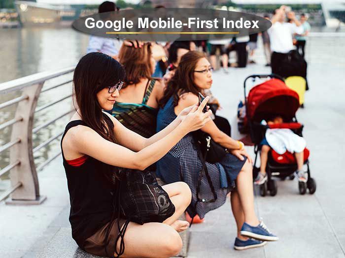
Test your content on a suitable development site intended for mobile users before going live with it. Commonly, mobile visitors arriving on a mobile site have different intent. Depending on the products and services that you sell, know if users want the ability to complete their whole consumer journey right there and fast. Or, for more expensive purchases, mobile is often a place where research begins and the purchase may come later from a desktop.
If your business wants to deliver customer-specific content to mobile users, you may need to expand your mobile budget. Google acknowledges that “complexity has kept many companies from achieving more than rudimentary personalization. Companies with fully integrated solutions are 46% more likely to be using audience-level data to personalize customer experience than the mainstream and are over 60% more likely to be optimizing experiences in real time using analytics”.
The June 27, 2017 article The Mobile Customer Experience is Written in Data talks about how marketing leaders are 35% more likely to have a documented data and analytics plan in place, and 28% more likely to believe that strategy principles are useful for decision making at all levels. Author Stefan Tornquist stresses that a key point of difference between leaders and laggards is owning a clear understanding of the customer journey across channels, mobile in particular.
Mobile user research indicates that they have stronger intent, which is all the more reason why preparations for better mobile search rankings are of such high value. Think about it. Desktop users are more likely to be comfortable sitting comfortably at home or in the office with more time to review results. Mobile users are on-the-go and browsing while multitasking. They don’t have or want the luxury of time.
8. Remove or Modify Intrusive Interstitials
How important is it to fit Google’s guidelines for interstitials?
While your core content may be present on the page and readily indexed by Google, if some content is visually obscured by an interstitial, it likely frustrates mobile users. Because they are unable to see it or access the content that they were expecting when they chose to click on your search result, they may quickly exit.
Pages that show intrusive interstitials have been determined by Google to offer a low-quality experience to users than other pages where content is immediately reachable. This is problematic on mobile devices with tiny screens that largely or only show the annoying intrusive interstitial. Audit and find what site performance improvements you can make for mobile users.
This is screaming obvious to most people, but actually providing a mobile site is the necessary first step for many who need to prepare for Google’s mobile-first index. A staggering number of businesses still lack any form of a mobile website. Getting this accomplished is vital if your lead generation activities that rely on mobile search.
You need a mobile site to adequately evaluate if Interstitials are blocking content.
9. Ensure that Mobile Pages and Mobile Apps Are Indexed
Audit to know that none of your needed JavaScript, CSS or image files are blocked and unable for Google to index. Avoid publishing unplayable content on mobile devices and irrelevant inter-links. You can let Google know how you want your mobile app to be crawled and indexed by configuring it correctly. It is the same as for your desktop website. When properly configured, they may appear as links in Google Mobile Search results, helping users reach your native mobile experience faster, and they should land precisely on the right content that matches users’ search intent. Pages with clean code for app indexing also display more prominently in mobile search results.
Joel Harvey, of Conversion Sciences brings needed clarity. He states that “responsive design, as we know it today is toxic to mobile conversion rates” and that “high-performing mobile websites will look more like mobile apps”.
Internet users on mobile devices are more susceptible to friction on a small screen. It is simply inherent in the nature of mobile. It is used so much because it fits in a pocket and goes with us everywhere. Mobile users want answers when they want it and how they want it. Long complex checkouts or form sign-ups for a free trial with one hand are challenging. If you standing in a line waiting to be seated at a restaurant, or to be seen in a medical practice, getting a quick solution, reviews, or research answer is a demand. Keep it simple to use. Forget some of the more complex features that load up additional JavaScript and CSS files.
10. Don’t shy from Long Pages
There are work-a-rounds to resolving the long page for a mobile user. A quality site takes advantage of these opportunities. For example, long pages partner beautifully with mini-IAs, which is a mini table of contents at the start of your web page. It functions to tell users what the page is about and provide quick access to those sections; this is helpful to users when reading in-depth articles. Long mobile pages also function well with accordion content, with sticky navigation, and back-to-top footer buttons. Such constructs for mobile design may become mainstream concepts like the hamburger menu has already done.
A deep information architecture (often being more than 4 layers deep and reached by cascading menus on the desktop), fails to work well on mobile. Remember that speed and ease of use are the two most important factors to the mobile user. They simply won’t navigate through too many steps to reach the suggested content. Long-form information pages are still of high value and fit a purpose; only if and when it provides a better user experience, consider moving some details to secondary pages.
11. Technical Errors Need More Attention
Technical coding and SEO mistakes drag your mobile site down faster than you may expect.
An article written by WEBCEO for Search Engine Journal says it stands without repeating; “A webmaster who allows errors and bugs on their site has no respect for themselves, their work or their users. This isn’t even a matter of ranking high in search results… though of course, that’s also a factor to consider.” It may be so bad that users cannot even see what you intended to show them, but risks of a penalty from Google for spammy markup or hidden content are very real.
If your mobile site suffers from technical issues that need repair, users that tire of facing these errors such as broken links, incorrect redirects leading to the site’s desktop version or former pages – may never return. The critical thing is to serving correct and consistent redirects, meaning a redirect to the equivalent content on your desktop or mobile site. If this configuration is amiss, users can be really frustrated as well as search bots. Many simple SEO fixes often lag unnoticed and merit swifter action. This is all the more important on mobile where many rich featured snippets entice mobile clicks. They depend on proper product schema implementation or other correct choices for structured data markup.
In the world past, where we had different kinds of links, different kinds of link formats for the different devices, mobile apps, and varying platforms. it was important that we mapped our web pages to those mobile URLs. There were various ways to map pages to mobile URLs. So you could use Schema.org markup on your web pages. You could go with JSON-LD. You were able to align them all up in your robots.txt file. Or you could use rel=”alternate” links. In a July 23, 2017, update, Google informed webmasters that “separate mobile URLs serve different code to desktop and mobile devices (and perhaps even tablets), and on different URLs.
If you own a different mobile website, an m-dot website perhaps, you should use rel=”alternate” to match the two together. In the former days of deep linking, where application-specific links existed, the rel=”alternate” was better to map them together. Make sure that your coding techniques are updated for mobile. Today, thankfully, everyone seems to be converging on one format: universal links.
We expect to see technical issues factor heavily into mobile rankings because of the limited bandwidth and smaller screen size of mobile devices.
Caching issues play their part when a browser seeks the most recent version of a mobile page instead of saving a copy to load it faster the next time. Many of these site performance issues are highly technical in nature. An excellent SEO who fix your speed issues is becoming must-have personal. If you fall short of achieving a perfect mobile score even after making multiple revisions, every increment closer to 100/100 will pay off well.
12. Refine your Use of Images and Image Optimization
Images are a huge part of mobile optimization. While listed last here, it is vital for gaining a competitive advantage in mobile search. True – some sites have such strong domain trust that they seem to get away with heavy images that don’t adhere to the guidelines. But that is less true here. Simply put, heavy images and using too many images are the highest contributing factor to slow loading pages.
Focus on elements that contribute to a blisteringly fast load page, and what is a pleasure to use on a mobile device. Images are engaging and important to help users identify with a page and stay long enough to achieve their goal in coming. Some choices you have are to use a smaller image, fewer images, a compressed image or an image with a lighter background; in return, you will gain better mobile results.
The core elements to performing mobile image optimization are a combination of tools and real user testing. There is a vast array of image optimization tools; find one you love and use it lavishly.
Google’s new structured data for the home service industry and search assets could empower its developers to build a broader set of capabilities into Google Home. We may see it connect Home with mobile search histories and users’ PC to provide a more personalized experience as well. Many business sites in this niche rely heavily on the use of images and may want to consider loading them from an off-site source.
Correctly optimize your images to comply with JSON-LD code requirements and to reduce their weight. Proper image file size and correcting missing image alt tags matter more in voice and mobile search. Mobile ranking factors are changing and they depend more on technical correctness than desktop sites.
Searchmetrics conducted a study on Mobile Ranking Factors to try and determine which factors affect mobile search rankings the most. Because mobile devices function with bandwidth constraints, it’s essential for web pages to load quickly without requiring the download of huge files. They reportedly found that the average loading time for the top ten mobile search results is 1.10 seconds. Additionally, top mobile search results were found to have smaller average file sizes than desktop searches, demonstrating the need to keep file sizes in check for mobile users for better performance. They concluded that file size is one key aspect of mobile page architecture and mobile-friendliness.
Excessive levels of HTTP requests include images. Not everyone stops to recognize that every image on a webpage contributed to the HTTP request count.
Successful Mobile Optimization Requires Dedicated Time
You should be winning clicks right in Google Mobile SERP real estate.
Mobile optimization stands on it owns and merits being treated that way. Unfortunately, this truth involves crafting a new strategy for strong mobile rankings and addressing it separately is a ton of skilled work. All too often mobile optimizers try to reduce the process to a quick modification of desktop SEO tactics and ride on the hope that they work on mobile. We prefer embracing mobile’s strengths, which naturally makes less mobile’s weaknesses.
There is no reason to hold visitors hostage on a small mobile site. Make it easy for them to save an item in their shopping cart and come back later. Cross-device shopping should be anticipated as many a single buying experience takes place over time and across multiple devices. Make the effort to set-up more analytics tracking and see how your mobile version is (hopefully) supporting your desktop version.
Reading and understanding your mobile web analytics can get considerably complex. Investing in additional mobile analytics software can save both time and money in the long run.
While tiny screens are a burden to web designers, mobile is pushing adoption of the reality that web content must be prioritized over the same fancy visual content on mobile. This may mean more humble UI elements such as buttons, sidebars, menus, footers, links, and so on. Currently, these designers continue the struggle to find the sweet spot for the mobile content–to–fancy visual appeal ratio. We see wider adoption of the navigation under the hamburger menu versus exposing it in tab bars and or shorting it in narrow navigation bars. SEO’s and web designers that finally agree on the need to prioritize content on mobile typically find winning results.
A review of your mobile user experience will likely help you will discover many things that need improvement. And that is a good thing. Learn from users’ insights in your SEO reports and comments that can be gleaned to understand reactions to common mobile design mistakes.
Transitioning from a desktop app to a phone app has been easier for mobile users than most SEO professionals, developers, and web designers. But the results are proving to be one of the best value investments you can make.
Common Mobile Website Design Errors
- Blocked JavaScript and cascading style sheets (CSS) support files.
- Heavy reliance on 301s or failed redirects.
- Poor UX and graphical interfaces (text too small and poor image pixilation).
- Lacking or awkward search functions.
- Lack of optimization for retail landing pages.
- Obtrusive interstitials that pop up and frustrate the user experience.
Web designers are tasked today with the need to create more than a standalone mobile website. It takes a flexible and teachable approach for each team player. Not only do we need to keep a keep end-user perspective, but we must maintain a website’s equity from a search engine optimization (SEO) perspective.
So what is best in mobile page creation? The answer will evolve as technology does.
What are ideal mobile design factors?
Home web page and mobile site navigation:
- Keep menu options short and clear.
- Make it easy for site visitors to get back to the home page.
- Don’t let pop up ads and promotions dominate the page.
Website search:
- Make it easy to spot where to conduct a site search.
- Ensure site search results are relevant to the query.
- Implement filters to narrow results for easy topic findability.
- Guide site visitors to better site search results.
Retail Shopping and conversions:
- Let potential consumers explore before they commit to buy.
- Let shoppers purchase as guests and not need to create an account to buy.
- Use existing shopper details to maximize convenience and reduce friction points.
- Use clear click-to-call buttons for multifaceted tasks.
- Make it simply to complete purchases later and if on a new device.
Combine Responsive Design with AMP and PWAs
Hill Web Marketing’s approach digital prefers marrying the best of responsive web design (RWD), and integrate accelerated mobile pages (AMP) to provide a truly better mobile-friendly website for our clients. Businesses who are only speaking to the responsive web design may not be aware that approach was not intended for speed, it was designed for designers. The end user cares about how fast the page loads. Caring about users over pretty page elements has proven over and over to produce more revenue.
AMP has become favored by publishers who serve fresh news articles and blog posts. It’s much like to Facebook’s Instant Articles format but will miss the ups and downs of a social media platform. Today AMP is used by numerous search engines and extends to the latest AdWords ad features. By employing the “Fast Fetch” tag, AMP advancements make this to faster and simpler to implement. AMP pages also work well at support LocalBusiness and industry specific schema markup.
According to Google, more than 900,000 domains have added AMP pages, and that number is burgeoning daily.
The best thing we find working today is to combine mobile search optimization with AMP pages and PWAs. PWAs can increase e-Commerce sales by better engagement on your site and increases shopping cart conversions. By making faster checkout times possible, your site offers and a better end-user experience. PWAs have the unique capacities to use the clout of offline resources and push notifications to keep up a conversation with users.
Is Google Using a Mobile-First Index already?
Yes. Initially they are testing it, and talking about it, and indicating a complete rollout by the beginning of 2018. Now that has been delayed.
Our intense “Mobilegeddon” update in 2015, which favored “mobile friendly” websites in the search results pales next to what’s about to happen. Google plans to no longer rank the desktop version of a site first, but will look foremost for relevant content it finds on a mobile version when matching queries. This will tip the way Google crawls, renders search results, and ranks web content.
Google’s mobile index will be separate from our familiar desktop index as it moves from testing to implementation. The search giant indicates that eventually there will be only the one index, and it will be mobile-first index. The site that fair best through past similar huge ranking updates are those that are well-prepared.
If your business already operates largely from a mobile site, then it is still worth rechecking how your content and links on your mobile site work. Look to determine if the mobile pages are sufficiently similar to your desktop version. Google has delayed going mobile-first to ensure that it can consume the proper content and rank sites as well as it did by crawling the desktop site. It also has produced more answers in immediate SERPs in the People Also Ask section – especially on mobile.
Users finding AI answers may click to your site.
Since the mobile-first index has arrived, expect that some sites will get results during the process of Google rolling it out. Your mobile content needs time to get crawled and indexed and added to mobile search listings in the same way as for desktop users. Perhaps your hard-worked for your mobile-friendly ranking boost when then be applied to your mobile-friendly pages and you can enjoy results rather than be scrambling to comply.
Google may opt to only index your mobile version of your website in this flip. It may mean that visitors view your mobile site displayed after conducting a desktop search on their desktop. The Google Search Console Fetch and Render Tool helps you learn how users see each version. This can protect you from providing a skewed site experience. Plan sufficient time for thoroughly mobile testing each and every page that you want to be indexed.
Dramatic Increase of Image Thumbnails in Mobile Search Results
Mordy Oberstein posted research showing that Google Adds Image Thumbnails to Far More Searches on Mobile. Since he owns a fabulous Mobile SERP Feature Tracker, he is the first to report an increase in page one mobile SERPs showing Image Thumbnails. “By the time the data leveled off, mobile Image Thumbnails had gone from appearing on 15.7% of all mobile page one SERPs to an all-time high of 44.5%” he states. And then with a bit of math notes that is a titanic-size increase of 183%.
Today this has increased significantly as more product visuals display in Google shopping results on mobile.
You want your product image thumbnails to show up; which means that your technical SEO on your eCommerce pages must be right.
“Every time a webpage takes too long to load, they lose a reader—and the opportunity to earn revenue through advertising or subscriptions. That’s because advertisers on these websites have a hard time getting consumers to pay attention to their ads when the pages load so slowly that people abandon them entirely.” – Google
“Understand how mobile users are currently navigating your site. Chances are, they don’t stay long, they bounce more frequently, they visit fewer pages. They don’t behave the same way because their environment and intent are vastly different. Why try to convert them the same way?” – CXL***
“Another important issue that is still not well understood by designers is that mobile content needs to be layered. That does not mean that we need to arbitrarily cut it or hide (which unfortunately is what many do), but rather that we need to prioritize the gist and defer the details to secondary pages.” – Raluca Budiu of Nielsen Norman Group***
Summary
How healthy is your site? Is it built for visibility across mobile devices? We can help you find out.
Attention spans on mobile are critically short. Leverage the Google Search Console AMP reports to know how Google sees your mobile pages working (or not working). Choose at least a few of the above suggestions to optimize your site for mobile users. Eliminating distractions, make sure your primary content is above the fold and get mobile users to the solution, or “reward” in short order. We can help you reduce the risk of over-simplifying your content for mobile, sluggish calls to action, and finding the thin line between being generously intuitive and too restrictive.
Long conversations still go on evaluating the concept of mobile optimization. Nor is a false perception that responsive design and mobile optimization are synonymous. This means that many mobile optimizers are still making many of the same basic mistakes when it comes to getting found in a mobile search. Formerly, SERPs have favored web pages with proven expertise, that are authoritative, and have a strong trust-worthiness factor. They will continue to be important alongside mobile readiness.
In the end, mobile users could care less if a site is called responsive or not: they simply what to gain the result they are looking for and move on. They don’t evaluate differences between a mobile-dedicated version and a typical responsive site. For them, anything that does not look the same as the desktop site is a mobile site. They are speaking their queries more today than searching by text – this means that planning for Google Assistant and other personal assistants means your business can answer.
People conducting voice-activated searches using their phone speak naturally. This means that natural language processing is an important aspect for you to consider.
What matters most to you as a business owner is if the mobile rendering of your site has poor usability, it is not “mobile optimized” or “mobile-ready” for strong rankings in mobile search. Hill Web Marketing can audit your tracking pixels to better understand your mobile site visitors.
From a usability standpoint, it doesn’t matter what WordPress theme you choose, what platform you are using, or other factors in how the site is implemented: we must obey the same rules of mobile site optimization and design.
Optimizing for Mobile SERPs
The more your site is mobile friendly for GoogleBot, the better protected your business revenue will be. If needed, we can help you implement these suggestions so you’ll be ready for mobile-first indexing world.
I work and live in the Minneapolis Minnesota area, and am passionate to provide both on-site and services to make it easy for my clients.
Call 651-206-2410 for services to run your capacity to show up strong in mobile search rankings and Voice Searches From Mobile Devices
* https://www.nngroup.com/articles/mobile-usability-update/
** https://webmasters.googleblog.com/2016/08/helping-users-easily-access-content-on.html
*** https://conversionxl.com/blog/responsive-design-vs-mobile-optimization/